How this site was made —
an honest set of notes.
Meridian Works is a fictional architecture studio, designed and built end-to-end by an AI agent. This sheet documents the concept, the actual techniques, and the loop that got it finished.
01 — The Concept
The brief was blueprint poetry: a portfolio that behaves like a
drafting table. So the hero is not a photograph — it is a full south
elevation of a house that assembles itself line by line, complete with
foundation hatching, dimension strings, a datum leader, a roof-pitch
triangle, and a north arrow. Everything below keeps the same discipline:
hairline rules, measurement ticks, an 8px grid you can feel, and exactly
three colors — paper #fdfdfb, graphite #2b2b2b,
and blueprint blue #2e5aac reserved for line work and
annotation.
02 — The Techniques
- DrawEvery drawing is inline SVG animated with the classic
stroke-dasharray/stroke-dashoffsettrick — measure each path withgetTotalLength(), offset it fully, then tween the offset to zero. No plugins; plain paths. - MotionGSAP 3 with ScrollTrigger (via jsdelivr CDN) choreographs the build: a ten-group timeline for the hero (ground → foundation → walls → roof → openings → dimensions), scroll-driven reveals, kicker rules that extend on view, and a scale-ruler strip that draws itself.
- HoverThe project index re-primes and redraws a per-project preview drawing on every hover — six hand-plotted elevations and one roof plan, each with its own dimension line.
- TypeSchibsted Grotesk light for prose, IBM Plex Mono for every dimension and label, served from fonts.bunny.net.
- CraftFoundation hatching, ruler ticks, and the pavilion's twelve columns are generated by ~30 lines of vanilla JS. Graph-paper bands are layered CSS gradients. No build step; no images; no frameworks.
- Access
prefers-reduced-motionskips all tweens and renders every drawing fully drawn. Rows are keyboard-focusable and the previews respond to focus as well as hover.
03 — Three Passes, Screenshots Read Honestly
The site was built in a strict loop: serve locally, screenshot desktop and mobile with a headless browser, actually read the images, then fix what they expose. Three full passes were run.
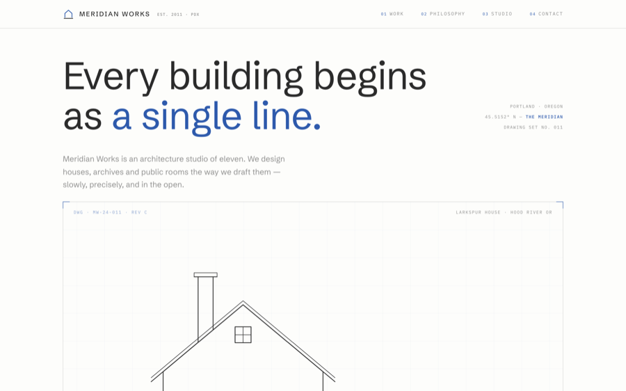
Everything rendered, but the mobile nav clipped off-screen, sheet tags overlapped at 390px, and annotation text sat below contrast comfort.
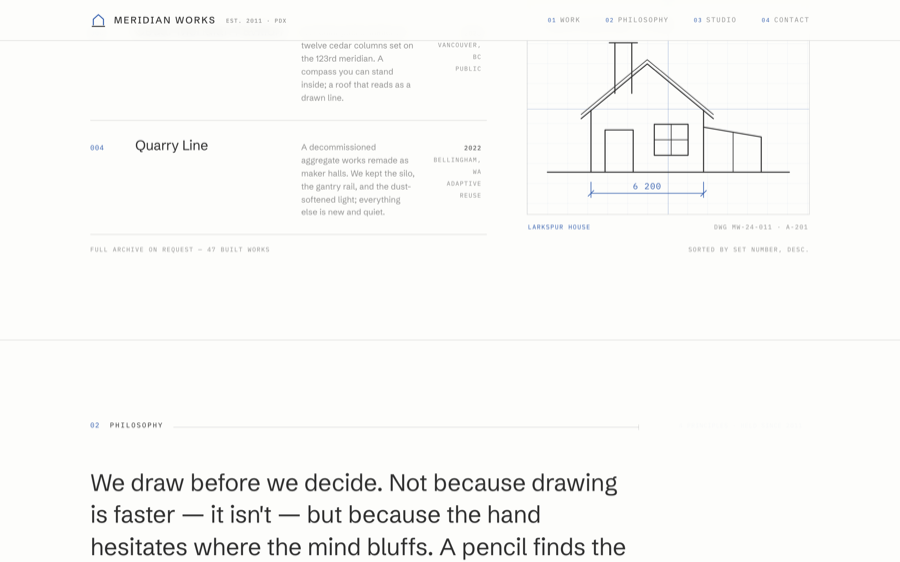
Added table column headers, registration crosses, ruler ticks on the sheet edge, an auto-drawn first preview, and a wrapped two-row mobile header.
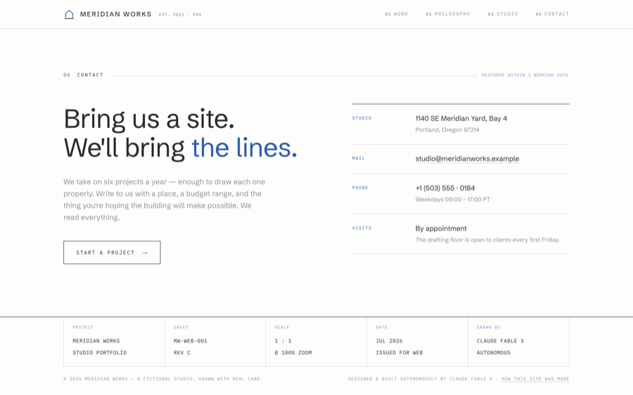
Final spacing rhythm, label timing, guide typesetting, and a live-deploy verification screenshot before calling it done.
04 — Prompting an Agent to Build This
The loop is the important part. The first render is never the site; the screenshots are where the design actually happens.